While user experience and user interface are elements of great interest and priority for all kinds of web designers and developers of modern websites that aim to rank high, gather a substantial audience and succeed, NDIS (National Disability Insurance Scheme, Australia) websites face a much bigger challenge with regard to both of these.
Optimization of UX on a website is done in accordance with the target audience of the website and its needs, demands, preferences, and so on. When the target audience segment for your NDIS website is such a complex group with different kinds of impairments that can significantly impact the accessibility of your website, developers and designers are faced with an especially higher demand for a more keen, focused, and considerate optimization of UX backed up by a significant amount of research.
The Impact of UX for NDIS Websites
There is the simple, applicable-for-all solution for the process of UX optimization available everywhere online, and then there is the much more complex and intricate series of steps that can be used for the UX optimization of an NDIS website. Many of those steps involve a significant level of research that has to go into the target market for NDIS websites – naturally composed of people with significant disabilities.
Although every website targeting a generalized audience logically should keep the disabled percentile of the population in mind, it is an absolute must for NDIS websites that aim to serve mainly and solely the disabled people and provide them with easy and quick access to the information and help that they need.
According to the NDIS itself, there are 4.3 million such people in Australia who have what they prefer to call “a permanent and significant disability that impacts their everyday routine” and who need support, services, and an early intervention to prevent unnecessary and avoidable damage as much as possible.
When your audience’s disabilities are impacting their lives to that extent – accessing, viewing and navigating through websites is usually one of the things they might face certain difficulties in. Almost all those difficulties can be solved through a few UX techniques and tools specifically designed for and aimed at the disabled community.
The Accessibility of Modern Websites
While these UX techniques remain essential for NDIS websites, they are also very important for other websites as 15% of the world’s population has some sort of disability that can prove to be a hindrance in their web surfing. If you ignore the disabled, you keep 15% of your market out of the entire spectrum of your audience on which you are basing your UX design. 15% of the world’s people mean 1 billion people – a huge number.
Websites these days are usually aiming at appearing sleeker and more sophisticated – focusing on the aesthetic side and professional looks – which can be good for savvy internet users but significantly crippling for the portion of the audience with disabilities. Smaller, more aesthetically appealing fonts and color palettes focused on aesthetics make things drastically complicated for such users.
Without further ado, let us get into the series of steps that can help you improve UX for your NDIS website significantly.
Market Research
Market research is important not just to give you an idea of what disabilities people have and what problems they face but also let you know which problems are more common and need to be addressed first. For example, when ranked with respect to frequency and the percentile of the total disabled population affected, the following disabilities are arranged like this at the top of the spectrum – in a descending order with respect to frequency of occurrence.
- Color Vision Deficiency
- Generic Visual Impairments
- Dyslexia
- Deafness
- Motor Disabilities
While this is a highly specific list of the disabilities that most people are affected by, the general types of disabilities when arranged in descending order with respect to the number of people affected across Australia are as follows:
- Intellectual
- Sensory and Speech
- Psychosocial
- Physical Restriction
- Head Injury, Stroke, or Acquired Brain Injury
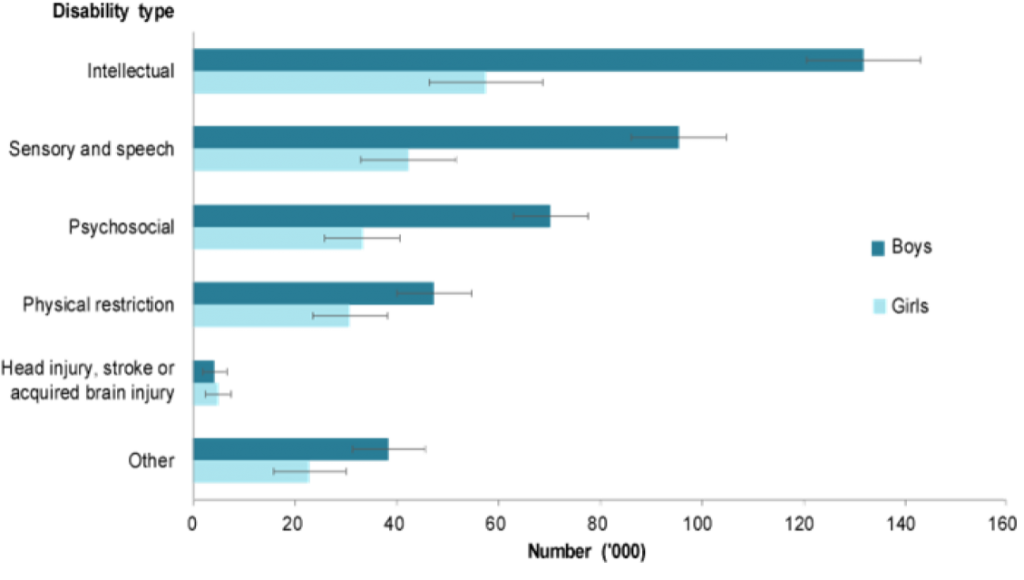
(Australian Institute of Health and Welfare, 2020)
You have to make sure that the data you have gathered about the frequency of disabilities is relevant or specific to the Australian population.
Let’s move on to the main problems that these specific groups face when navigating through websites, as we have to recognize them before we can address them.
Color Vision Deficiency
While color vision deficiency affects 8% of the total population of males in the world and 0.5% of the female one, it is often ignored by designers while designing user experience and interface. Most of the modern websites and applications use different colors to help users differentiate in certain design elements. The problem is that while any normal user can recognize the contrast, people with color vision deficiency such as deuteranopia and tritanopia cannot.
The contrast is not clear to them AT ALL and therefore, they fail to recognize the design elements completely. Deuteranopia or red-green blindness is the most common one, and such users cannot differentiate in red and green buttons that you may be using on your website. Even so, red and green are two of the most common colors used in UX design to help people differentiate in good and bad buttons because green is associated with good and red with bad. So, it is usually like green is “OK” and red is “NO.”
That significantly impairs the ability of color-blind people to benefit from or even understand the interfaces designed. Let us go through a few examples of what a normal person sees versus what a color-blind person sees, so that we can be more empathetic about the disability of color blindness of deficiency.
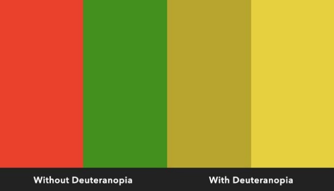
To deuteranopic people, both the colors red and green appear as shades of yellow which are not nearly as distinguishable.
Normal Color Vision:
Protanopia (Red blindness)
Deuteranopia (Red-green Blindness):
Normal Color Vision:
Protanopia:
Deuteranopia:
Tritanopia:
Generic Visual Impairments
This group includes the people who are partially blind due to some disease like cataract that they contacted or due to any kind of biological issue – a birth defect or otherwise. They will obviously have trouble reading the website’s contents and differentiating in all the design elements UNLESS the design elements are very clear and vivid.
Dyslexia
Around 7% of the world’s population – that’s half a billion people – have some serious difficulty in reading words and are called “dyslexic.” The most common problem for dyslexic people is that they have a tendency to flip letters – perceive ‘b’ as ‘d’ or ‘p’ as ‘q’ – and also find it very hard to differentiate in different letters and thus spend a longer time trying to recognize the shapes on the screen and make sense of them.
When modern designers focus on aesthetics, legibility is often given a secondary preference. The problem is that no matter how pretty the information looks – it is useless if it is not getting conveyed or delivering its meaning in the first place. An important function of an NDIS website is to actually inform and educate people to motivate them to ask for help. The NDIS program is for the disabled, and if the disabled can’t really access any information about it, it will automatically lose its purpose and meaning.
Deafness
Deafness is a problem that, despite being common, does not really affect UX at a very large scale because websites are usually composed of stuff that people need to read or see – not listen to. However, some elements like introductory or informational videos can complicate things for deaf people as they cannot make sense of those – so sound shouldn’t be entirely relied on in any design element or content type.
Motor Disabilities
Motor disabilities are very common in the elderly as well as the disabled – people may not be as adept with a mouse or a keyboard or even with using a touch screen as they need to be to navigate through a complex interface. For example, very long commands like the “command+option+shift+s” used by PhotoShop can make things complicated even for normal people.
Researching “Solutions, Aids, and Favored Design Elements”
Once you have recognized all the problems that users may face while navigating through an NDIS website, it is time to devise solutions to all of those that can be possibly solved with the help of some minor tweaks to the UX.
Color Vision Deficiency
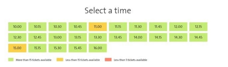
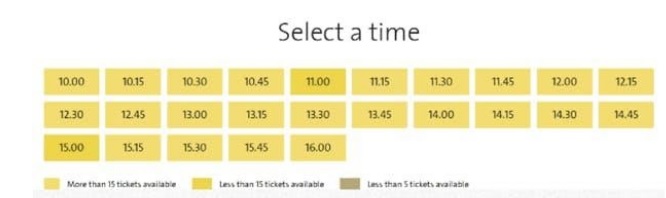
To solve the problem for people who cannot rely on colors to guide them, designers must make sure that they closely monitor the entire user journey across the platform and do not leave any point at which the user is forced to try to distinguish colors to understand something. For example, the colorful tabs and design elements can be enhanced by text, symbols, textures, and distinctive borders.
An example is the technique that BBC Sports has used to make its charts and tables more friendly for color blind people.
Before

After
Hence, the introduction of a single assistive letter in the colorful block could help the viewer ascertain what it meant.
Where it is not possible for designers to use text or symbols, they can always resort to introducing markedly different textures or outlines that have nothing to do with color.
Some tools that designers can use to actually view their design from the perspectives of color blind viewers and optimize their NDIS websites accordingly and easily are as follows:
- Userway Contrast Checker
- Color Oracle
- No Coffee
- Guide to Soft-Proofing for Adobe CC Software
- Coblis Simulator
- BetterFigures
Generic Visual Impairments
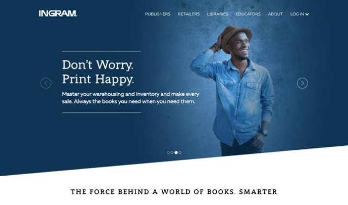
People with a generic visual impairment can always be helped by using the right fonts and colors – with clear, bold, straight letters that can easily be distinguished and read. The right size of tabs and not cramming pages with options is another key to helping them see and find what they need to. An important example is one of Ingram that uses Sans and Sans Serif fonts only and adequate spacing to make things easier for its users.
Dyslexia
To aid dyslexic people in distinguishing among letters and reading the content you have posted on your website, you may choose a font that is dyslexic-friendly. Now, what is a dyslexic friendly font? It is one in which each letter has a very, very unique shape. In which they cannot just flip ‘b’ to ‘d’ because ‘b’ and ‘d’ are not mirror images of each other and they can be distinguished despite the flipping.
Christian Boer, himself a dyslexic, founded the Dyslexie font which can be easily read by dyslexic individuals.

Deafness
While deafness is not a major problem for visitors of websites that do not use much video content, it is important for an NDIS website supportive of the deaf community to keep subtitles a top priority if they need to use such content and still convey their point easily to the elderly who may have a bad hearing as well as the deaf.
Motor Disabilities
Offering simple and small keyboard shortcuts can solve the problem for people with motor disabilities who may have difficulty with a mouse or a touch pad or even complex keyboard functions and commands.
Sketch has solved this problem by offering very simple keyboard shortcuts like simply an ‘R’ command for a rectangle drawing. Websites like Atomic.io and Dribbble are also using the same technique in their web design and therefore, you can easily use it for your NDIS website as well.
Implementation of the Knowledge and Intuition While Designing Wireframes
The next step obviously involves the knowledge gained from the research above but learning proven techniques is not enough as there are many kinds of disabilities that have not yet been considered in UX design. To address those, web designers may have to be more intuitive about their wireframe design. They need to design something as simple and clean as possible.
User Testing and Feedback
While research and intuition can help you through half the way and remove many problems, the final modification of the UX web design is obviously based on user testing and feedback. Having a group of people with a range of disabilities (preferably the most common or frequently occurring ones) and seeing them go through the user journey and getting their feedback can be your best shot if you want the UX design to be just as perfect practically.
Modification of the Web Design
Some very important tools and techniques that can be used to address the main problems faced by all kinds of disabilities are listed below:
- WCAG Compliance – please review Web Content Accessibility Guidelines and keep them in mind
- Improving Navigation through Services Available – Less Crammed, Less Interactive Webpages and More Prominent Buttons
- More Graphic Illustrations, Less Wordy Explanations
- Content That Can Be Consumed by All – Audio available along with Text
- NDIS Specific Content
- Choosing the Best Vocabulary and Tone
- Guided Search
- Clear and Frequent Calls to Action
- Stories of Successfully Delivered Aid to Motivate and Inspire the Audience
- Extensive FAQs about NDIS Services