Building a website can be a daunting project – with all the project requirements, goals and designing required, it can be a significant undertaking.
After all, your website is essentially the “face” of your business to online customers.
So when OneCosmetic (OC) approached us with a project to design a brand new website for them, we rolled up our sleeves and got down to business.
The Context
OneCosmetic (OC) first approached us because they had heard about us through the Macquarie University Hospital (another client we had developed a website for). One of the doctors at OC, Dr. Wessels, was actually a lecturer at the University.
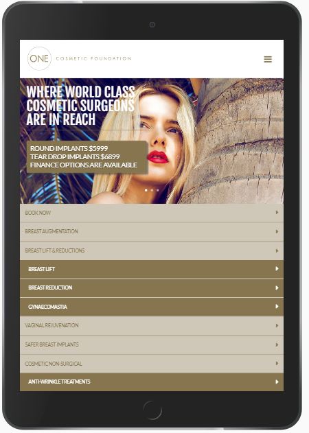
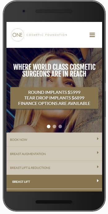
The challenge was to develop a website with great design that was consistent with their current branding (as they had their own on-site designer). On top of this, we had to ensure that the pages were mobile and tablet friendly.
Along with these design requirements, we also had to bring this together with our understanding of providing great user experience, so that information would be easy to find.
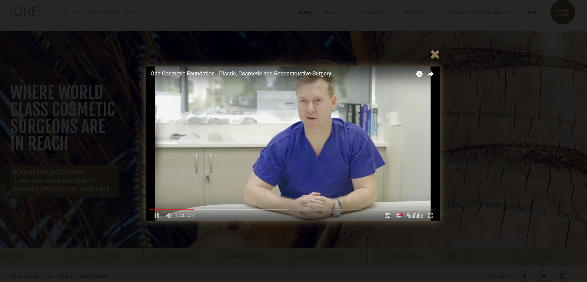
Furthermore, they asked us to integrate their social media and videos into their website, so the user could have a seamless experience when browsing.
OneCosmetic’s Requirements
Here are some of the requirements OneCosmetic had for us:
- Build a website that generated enquiries and bookings
- The website should provide information about OneCosmetic’s values, services and news.
- A design that conveyed excellence and quality cosmetic surgery services
- A simple booking system that allowed visitors to quickly and easily contact OneCosmetic.
- Social media integration
- Video integration
The Process
We began the project by working closely with OneCosmetic’s designer, Kasi, to ensure that the branding remained consistent throughout the website.
We also had to bring together the vision behind the design along with providing a great user experience.
We made sure that the website would be easy to navigate (through our own years of experience in UX design), while also meeting the requirements Kasi provided us.
In particular, one of our team members spent a lot of time designing separate layouts for mobile and tablet devices. This was to ensure that the pages wouldn’t distort when people visited the pages using devices with smaller screens.

Additional Work
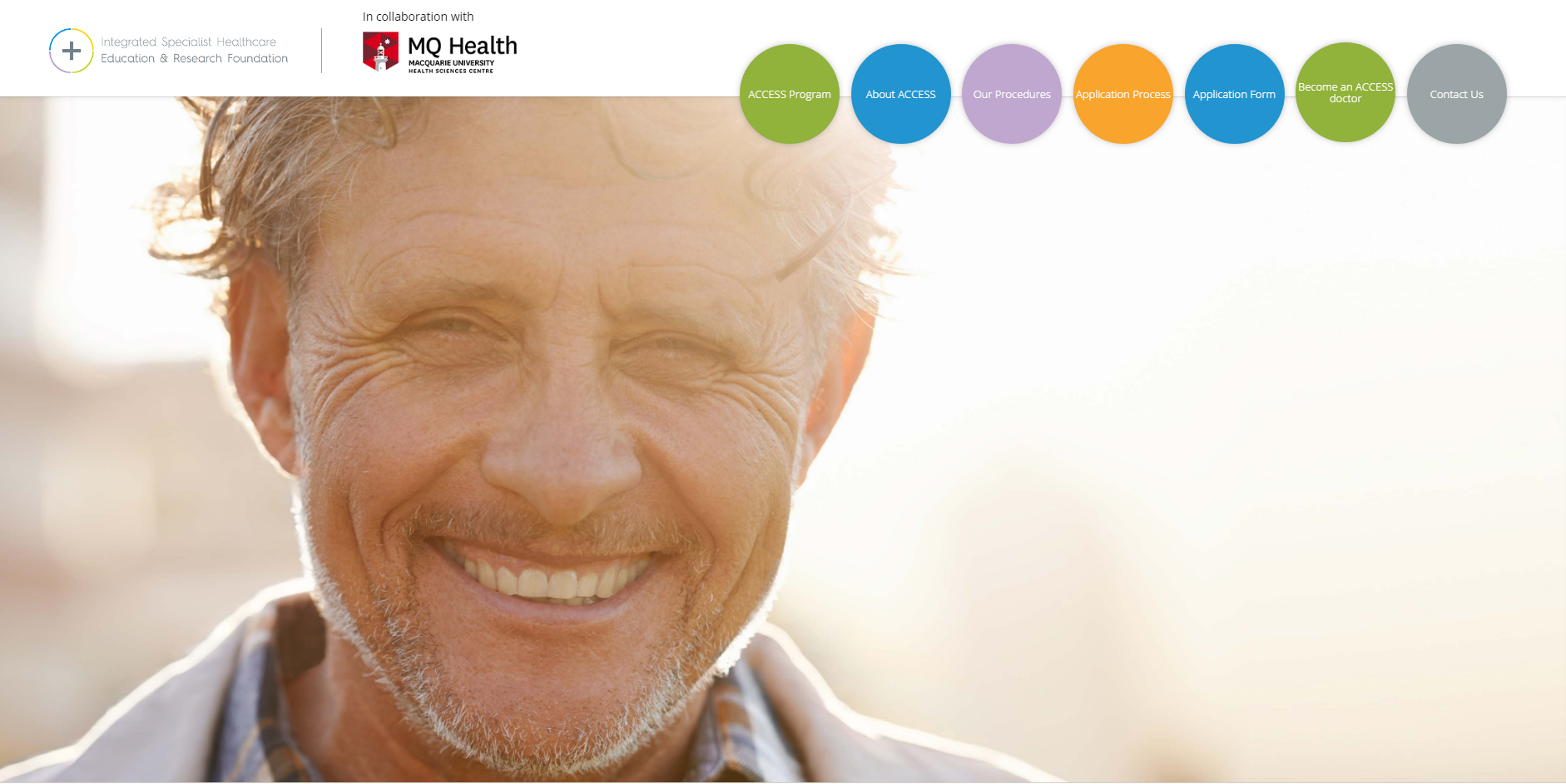
After the job was done, we also created an additional website for OneCosmetic to promote their ACCESS program. This was a program that provided surgery services to those who really needed it, but could not afford it.
OC have told us that the ACCESS program website is generating plenty of enquiries, which they are ecstatic about.
Overall, both we and OneCosmetic were proud of the results and hope to continue our great relationship onto 2018.


