The Context
Reimagine.today is a not-for-profit organisation that supports those living with mental health conditions by helping them navigate the NDIS (National Disability Insurance Scheme).
The website was built to help Australians access the NDIS – this government scheme helps those with permanent and significant disabilities by giving them access to services and support.
The support covers a wide range of services such as doctor appointments, public housing, justice, aged care systems and provides funding for necessities.
The Reimagine.today website was built to provide information for those with mental health conditions, on how to get access to the NDIS services and funding, therefore required a great user experience.
The target audience were not expected to be tech-savvy as most would have disabilities.
Because of this, our team at Web 105 took special care to focus on making the website accessible to a wide range of audiences.
Reimagine.today’s Requirements
- Website must be accessible and easy to use for a wide range of audiences
- Mobile friendly
- Stay within a relatively small budget, but still get core functionalities running
- Great user experience for those with disabilities
- Social media integration
- Website should be visually pleasing
- Provide a glossary page to help users understand terms used in the mental health disability sectors
The Process and Challenges Faced
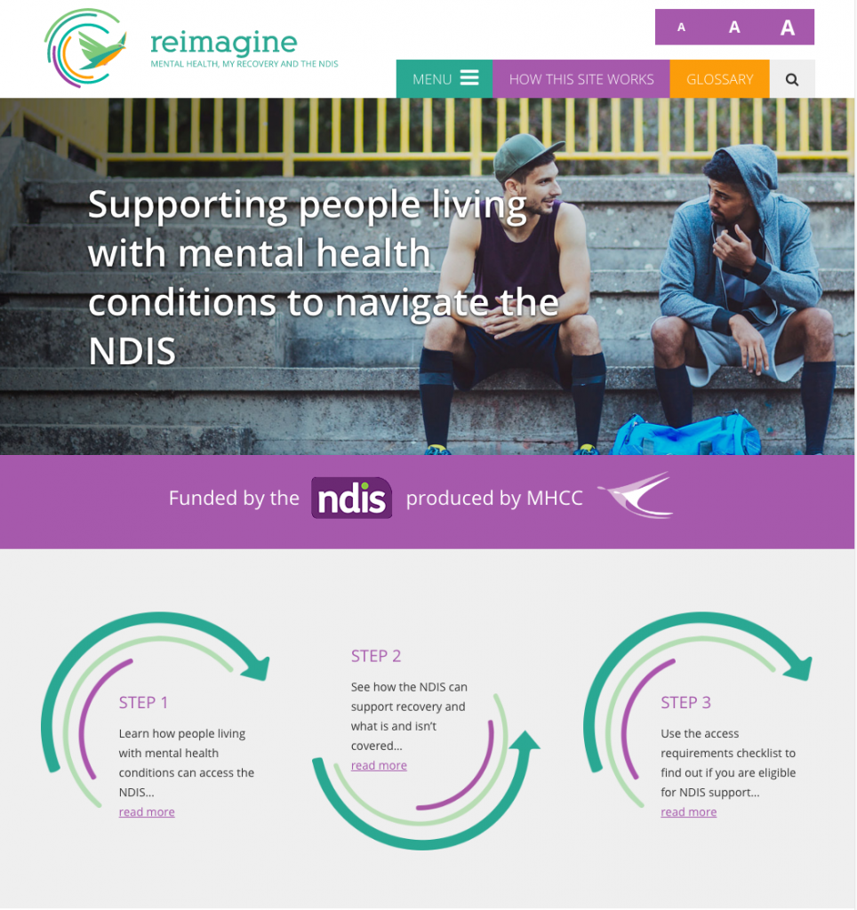
To begin with, the client required accessibility for a wide range of users, so we added a feature that would allow users to click and edit the font size to be larger or smaller (as necessary for their needs).
The main challenge was to build the website with all the features the client required but to also stay within their relatively small budget.
To achieve this, we invested time into researching third party tools that would save development resources and costs (albeit at the loss of customisation and full ownership) that would get the job done at a lesser price.
We consulted with the client to discuss which software would be best suited for their needs, while taking into account both the pros and cons of each.
Furthermore, we matched our technical expertise with the needs of the client to develop a website that would provide a great experience for their users while staying within budget.
Fortunately, the WordPress platform that we built the website on, provides a massive marketplace of third-party plugins that let users install features as required.
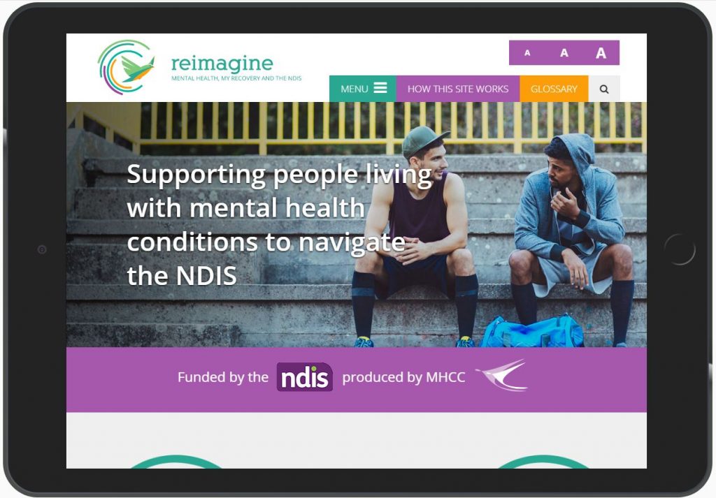
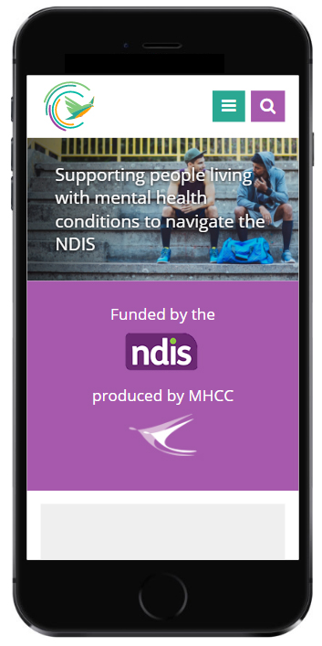
We also made sure that the website would be easy to navigate on mobile devices as well, as this is a key trend on the web that makes a heavy impact on usability.
Another example of good UX design we implemented was ensuring that the buttons were large and colourful, so users would know to click these.
We also avoided cluttering the navigation bar with links as this can confuse first time users.
Instead, we used a simple 4 link navigation bar, with clear descriptions like “How This Site Works” and “Glossary.” The homepage itself focused on laying out step-by-step, on how users could navigate the NDIS.
Lastly, we integrated the client’s social media platforms into the website and placed the finishing touches on the images to present a fully completed website.
In Conclusion
We were delighted to work on the Reimagine.today project as it is a non-profit organisation with a great mission that we were honoured to be a part of.
We hope that the website continues to provide great information for those with disabilities, so they can get the funding and support they need.
Is your organisation involved with the NDIS and need a custom website developed specifically for this purpose?
If so, get in touch with us today!
We have extensive experience working with non-profits and healthcare organisations.


